case study :
Chowder Rules! A True Story of an Epic Food Fight
title: Chowder Rules! A True Story of an Epic Food Fight
author: Anna Crowley Redding
illustrator: Vita Lane
publisher: Islandport Press
publishing date: October 2020
my role: illustrator

In the early spring of 2019 I was contacted by Melissa Kim, editor at Islandport Press, asking if I would be interested in illustrating a book they were working on. In our first phone call, Melissa told me about the manuscript and the author, Anna Crowley Redding, what they were looking for in regards to the schedule, the art, and she also referenced a promotional postcard I had sent to her 5 or 6 years years prior. (note to other illustrators: what they say is true… editors and art directors do hold on to postcards that they like!)
We met in person shortly thereafter, with the art director and designer, Teresa Lagrange. The three of us talked about the style of and hopes for the book, and we all brought picture books we admire to show and discuss. I took notes and made messy thumbnail sketches. I took photos of some of the books they brought. A plan was formed. Once the contract was signed, my work officially began.
⇩
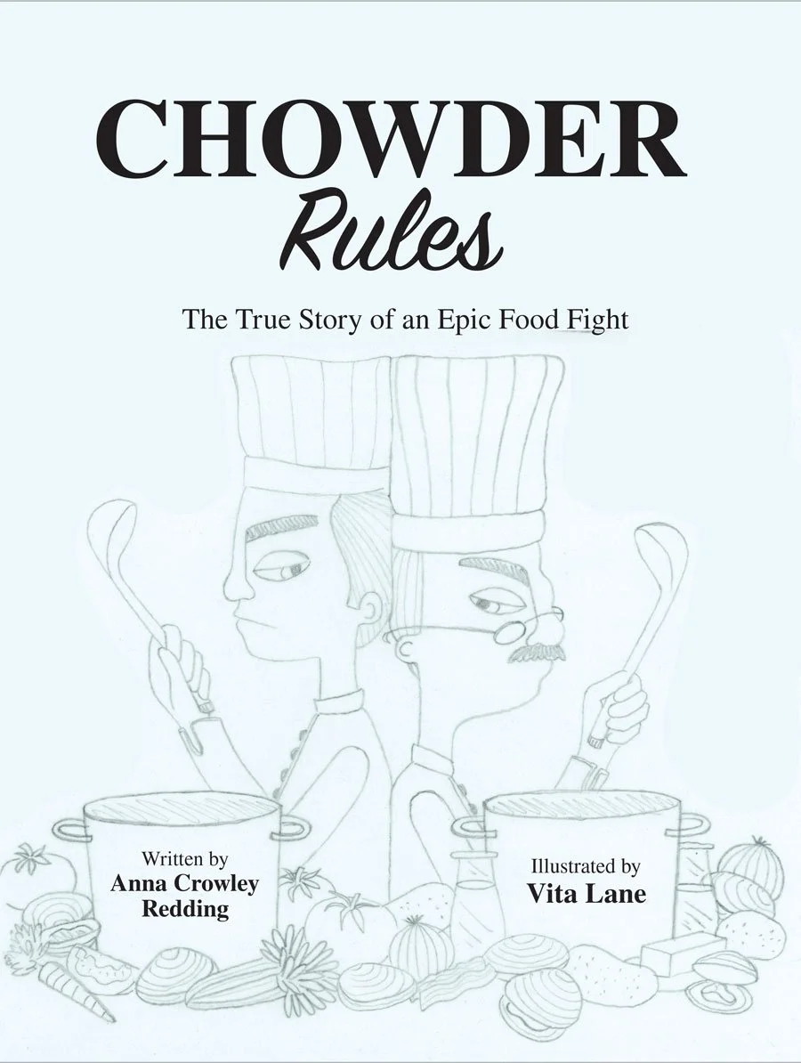
Cover
The production schedule for Chowder Rules! was nice and long, so I was fortunate to be able to start working on the interior thumbnail sketches before the final art for the cover was due. This meant I was able to really think about the cover at the same time I was planning the interior.
For the cover (and the interior too) I worked closely with the editor and art director. Before I began we talked about ideas, each giving suggestions for what the cover could look like, and what important things it needed to convey. Once I started putting pencil to paper, I made a lot of notes, scribbling down ideas and snippets of ideas. I made a lot of almost indecipherable thumbnail sketches. I walked away from them for a few days and then came back with fresh eyes and made more sketches. I collected the strongest and presented them to the team at Islandport Press.

cover options I presented to the publisher
final pencil sketch for the cover
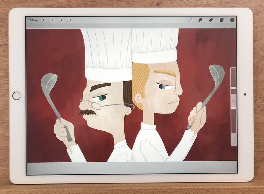
The team decided that the duel/cook off was the way to go, so they chose option 1. I was pleased with this direction, as it would mimic an inside spread I had planned - to show the main character and his rival back-to-back in an old fashioned dueling pose, holding soup ladles and wearing chefs clothing.
The next step was to do a clear and clean pencil sketch. As with all my sketches, I started out pencil on paper, scanning in the elements I like and tweaking the composition digitally in Photoshop.
After the pencil sketch was approved, I moved on to the color study. I figured out a color palette for the book (which I’ll go into more detail about further below) and for my work, doing a color study is a very important part of my process. It’s the time where I slow down and get a firm plan in place before diving in and creating. They are rough - just blobs of color to give the overall impression of where each color will go - and I do them digitally. It’s not about shading or rendering at this point, but about planning.
When I did these color studies, I couldn’t come to a decision. I had come up with 2 options for the cover that I like equally - teal and gray. I let Melissa and Teresa make the call, and they chose teal.

color study options - teal and gray
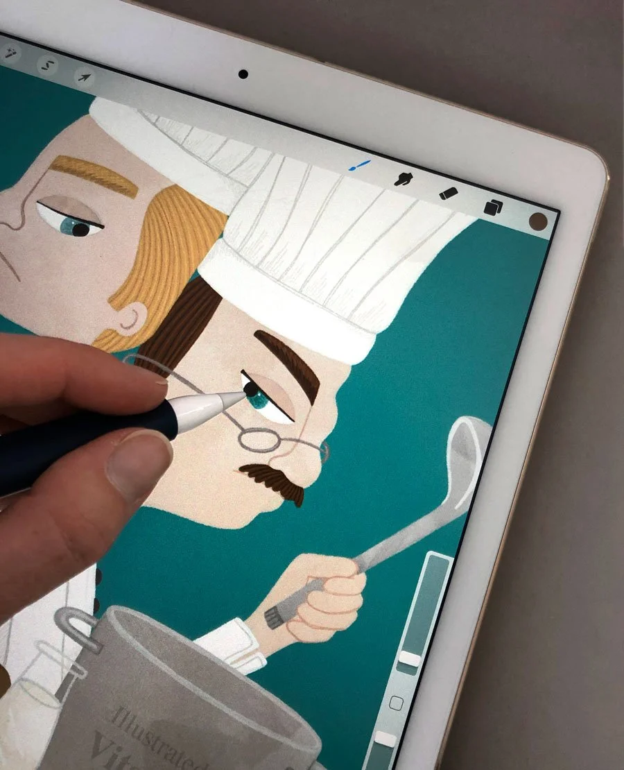
The final art of Chowder Rules! was created mostly in Procreate on my iPad Pro. I painted and scanned in watercolor and acrylic textures and paintbrush-and-blob elements, as well as other interesting paper textures to use in almost a collage manner throughout the book. I painted digitally, and assembled all the collage textures digitally, with some minor Photoshop tweaking at the end.

The art director had a suggestion to add elements of the NYC skyline and Maine lighthouse to the background. I loved the idea. It really helped to show the two locations rivalry, and added visual interest.
I handlettered the subtitle, and did my final tweaks, while Teresa compiled it all.

final front cover

1. The Journal Times (Racine, Wisconsin) 1/31/1939 2. The Portland Press Herald (Portland, Maine) 3/4/1939 3. The Portland Press Herald (Portland, Maine) 3/4/1939 4. The Portland Press Herald (Portland, Maine) 3/4/1939. 5. Pottstown Mercury (Pottstown, Pennsylvania) 3/7/1939 6. photo of Cleveland Sleeper Jr. from ancestory.com

early sketches of Sleeper and Tully
The Characters and the Color Palette
Chowder Rules! is based on real events that happened in 1939, so when I turned by attention to figuring out what the characters in the book would look like, I had to do my homework. I was very fortunate that Anna had done so much research herself when she was writing the story, and shared many newspaper clippings with me about the event. And I was even more fortunate that there were photos with some of them…I wanted to make sure the characters in the book showed some resemblance to the real people. The photos we found served as great inspiration for not only the main characters of Sleeper and Tully, but for the judges of the cook-off and also for some of the scenes in the book.

early sketches of the judges
I researched 1930’s fashion for men, women, and children, 1930’s architecture (and earlier, for depicting Sleeper’s childhood home). And 1930’s radios, microphones, and more.
There was even real life inspiration in my own home. My husband, James, has an old typewriter from the 1920’s that used to belong to his grandfather, and I used it as the basis for Sleeper’s own typewriter - and James was the hand model.


final character designs and color palette
For the color palette of the book I was quick to decide that I wanted it based off the ingredients of the two rival clam chowders. All of that food plays a big part of the story. I tend to gravitate towards more dusty colors, and this time was no exception. After a lot of thought and working-things-out, I landed with this color palette here, shown with my final studies for the two main characters.

I used the ingredients that inspired the color palette in the endpapers…one for New England and one for Manhattan
Interior
When I began thinking about the interior of the book, I started with post-it notes. I planned out each spread by doing rough thumbnail sketches on a post-it, and hung them all on the closet door of my studio. It made it easy to look at and plan, and to move things around. If the timing of one part of the book wasn’t working, I took a post-it or two down and shuffled things around. I used different colors for each round of revisions, and there were several. I worked closely with the editor to get the story and pacing just right.

putting the thumbnails into book form helped with creating impactful page turns and flow

hanging up post-it notes made it easy to see the whole book at once
At the same time, I took my rough thumbnail sketches and enlarged them a bit and made a dummy book (3 1/2” x 4 1/2”). This really helped with seeing if the story made sense, making the page turns as impactful as possible, and ensuring there was enough room for the text. This tiny dummy was revised each time I revised the post-it notes.
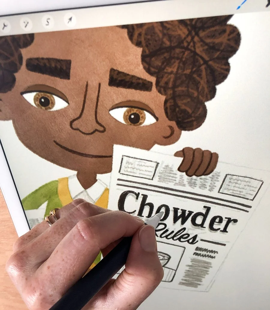
Once the thumbnail sketches and pagination were approved by the team at Islandport Press, I started the detailed pencil sketches. I blew up those tiny thumbnail sketches to the full size of the book, and drew over them using a combination of tracing paper, vellum paper, and regular sketching paper. Sometimes I drew large portions of the art all on one sheet, but most of the time I used layers and layers of tracing paper, getting every detail exactly how I wanted. The composition of each spread was done digitally, with all of these scanned-in sketches.
After the pencil sketches were approved, I did my color studies for each page in Photoshop. Using my chosen color palette, I roughly filled in the artwork with blobs of color, thinking, planning, and revising as I went along (just as I did for the cover). This is such an important step in my process, and sometimes it’s not fun. But wrestling with color is necessary because I can’t start the final art without having this all figured out. When I’m doing the final art, colors certainly shift from time to time…sometimes simply the value of the hue, and sometimes even the entire color itself … but having a plan in place at the beginning helps me so much. I know where I’m going and the color studies give me the roadmap to get there.

a pile of final pencil sketches
digitally painting on top of the pencil sketch

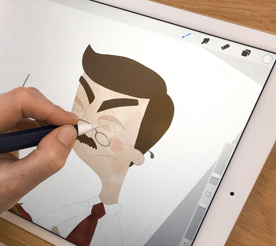
Once the color was figured out, I brought the pencil sketches and color studies into Procreate on my iPad Pro, digitally painting the illustrations with a combination of scanned-in real-live watercolor washes, acrylic paint and paper textures, and digital brushes. It felt really good to see it all come together.

so many layers in each file

real acrylic and watercolor textures make up each tomato
I brought the files into Photoshop for some final tweaking, and then it was done and off to the designer for her part in the production process.
Chowder Rules! is on sale now and I hope you will consider picking up a copy for yourself or a loved one. Please support your local bookstore.
