case study :
A Teacher’s Guide to Mentor Texts
title: A Teacher’s Guide to Mentor Texts
authors: Allison Marchetti and Rebekah O’Dell
series: Classroom Essentials
publisher: Heinemann
publishing date: April 2021
my role: cover and interior design, typesetting

The popular and critically acclaimed Classroom Essentials series, geared for newer as well as experienced teachers, is about foundational student-centered practices and is published by Heinemann. I created the aesthetic of the series, and set the standard of how information is presented in a highly designed, graphic form. I’ve typeset these extremely complex books, all with their own unique look and feel that fits within the series. I’ve managed this complexity while honoring the stakeholders’ visions and maintaining the schedule for each.
A Teacher’s Guide to Mentor Texts is the sixth book in the series. It is softcover, and 136 pages.
⇩
Cover
As this was the first title of the series that was geared towards teachers of an older grade range, grades 6-12, the authors, editor, and marketing were looking for a cover that was more sophisticated than previous Classroom Essentials books. Another consideration of mine was to give a nod to the covers of the two previous books these authors published with Heinemann, either through some sort of watercolor texture or use of typefaces. The art package of this title had almost no student or classroom photos, so any that we wanted to show would have to be sourced through stock houses.

initial thumbnail sketches
My process of working on any book starts with research and inspiration-gathering. I make lists of words associated with the concepts of the book and collect images in Pinterest boards - samples of typography, photographs, posters, book covers, web graphics, infographics, stock images, color palette inspiration, and anything that catches my eye. From this collection I curate a moodboard for cover and interior concepts, and for this title specifically I made sure to include the design aesthetic from the authors’ previous Heinemann books, including the typefaces used there. With all this reference material put together, I sketched out rough thumbnails.

a few of the earlier cover options
Several features of the Classroom Essentials covers are boilerplate, such as the vertical charcoal bar with the CE logo, as well as the publisher’s logo in the lower right corner. Taking these into consideration, as well as the previous books in the series, I turned to InDesign and came up with cover options that would look unique and not resemble any of the previous CE titles in aesthetic or color.

the final cover
After I designed a number of options over several rounds, the annotated cover became the final. I tweaked some of the typography to clarify hierarchy, and worked closely with the editor to finalize the wording of the annotations themselves. This cover reflected the content and how importantly annotations are highlighted throughout the book.

full cover
Interior Design Sample
Once the front cover was approved, I moved onto the Interior Design Sample. The sample consists of the front matter, at least one full chapter, and any other elements or design features that will be in the book, and is heavily influenced by the design of the cover.
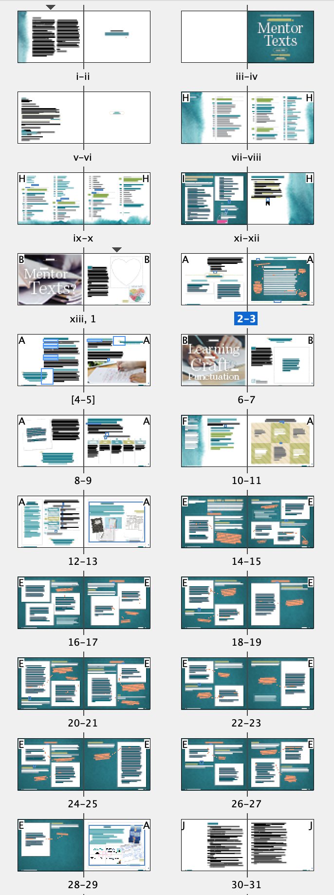
the entirety of the Interior Design Sample, round 1
a closer look at the chapter opener • Interior Design Sample, round 1
This is where I work out how I think the aesthetic of the book should be, based on the design of the front cover and the content of the book. I figure out the hierarchy of the text, determining the design of the A-heads, B-heads, basal text, and so on. This is also when I work to get all stakeholders on board with the look and feel, and it’s their opportunity to request design edits and clarify any issues. At this stage in the process I was using stock photos on the verso page of the chapter openers, and working out the best use of the color palette (from the cover) in the interior.
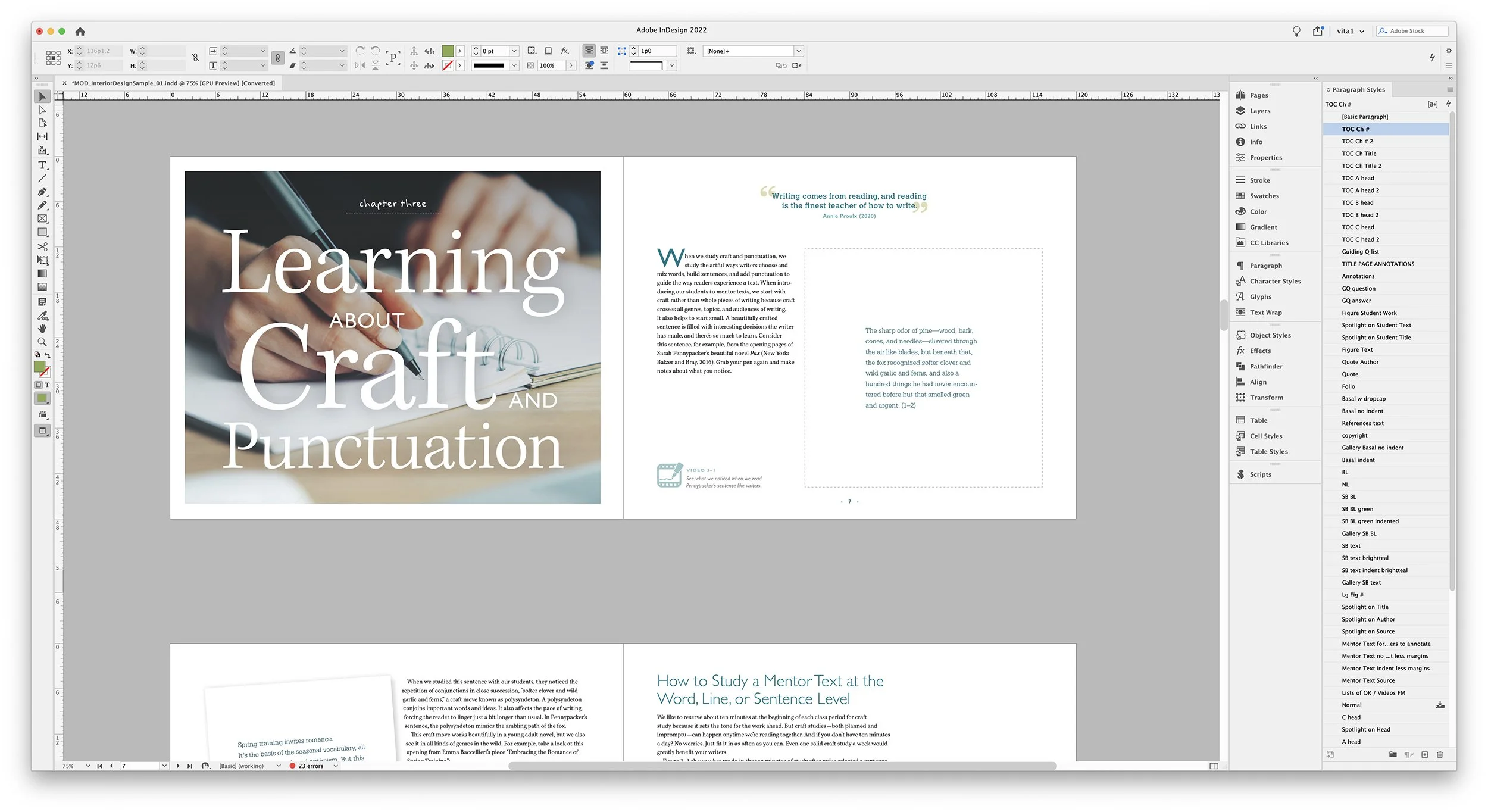
the second pass of the Interior Design Sample
The authors were struggling with the idea of using photos in the chapter openers, so we did several rounds of typography-only options before settling on a final design.

final chapter opener, as shown in the book
I used a beautiful stock image of a watercolor bloom I found during the cover-development stage as the background of the verso page, layered with an oversized typographical treatment of the chapter title. I finished it off with a pop of color from the salmony-orange annotations and arrows.
Based on the feedback I continued working on the color palette in the sample, and the design overall started coming together for a cohesive look and feel. Headings and basal text were tweaked, and certain global elements were worked on. After several rounds of back-and-forth between myself and the stakeholders, we settled on a final design that had the right balance of color and sophistication.

color palette, round 1

color palette, round 2

final design, as shown in the book

various elements, round 1
I also worked on how other Figures in the book would ultimately look, evolving them to reflect the revised color palette, tweaking the design of their headers and borders.

final design, as shown in the book
Several chapters had a mini-section called the Gallery that contained samples of mentor texts with annotated notes from the authors. During the interior design sample stage, I worked with the editor to elevate this from a simple A-head into its own robust design, who’s title tyographically reflected back to the chapter title and was set on a dark teal background, making these sections easy to find for the the reader.

gallery section, round 1

final design, as shown in the book
Typesetting
Once the Interior Design was approved, and the final manuscript was passed to me, I did a quick castoff to determine the page count. A Teacher’s Guide to Mentor Texts came in at 136 pages, with a trim size of 10” x 8” horizontal.
I set up my InDesign files using the Book feature and organized it so that each chapter or section of the book was a separate InDesign file. This helps me stay on top of the edits that I’m asked to do, and makes things easier to keep organized.
With long form documents in InDesign, I follow best practices such as using parent pages, conforming the design to a well-thought-out grid, snapping the basal text to the baseline grid, choosing legible and attractive typefaces for headings and running text, using paragraph and character styles, object styles, and so much more.

a view of the main grid I used in InDesign, and the Book panel

this graphic was a table in the manuscript
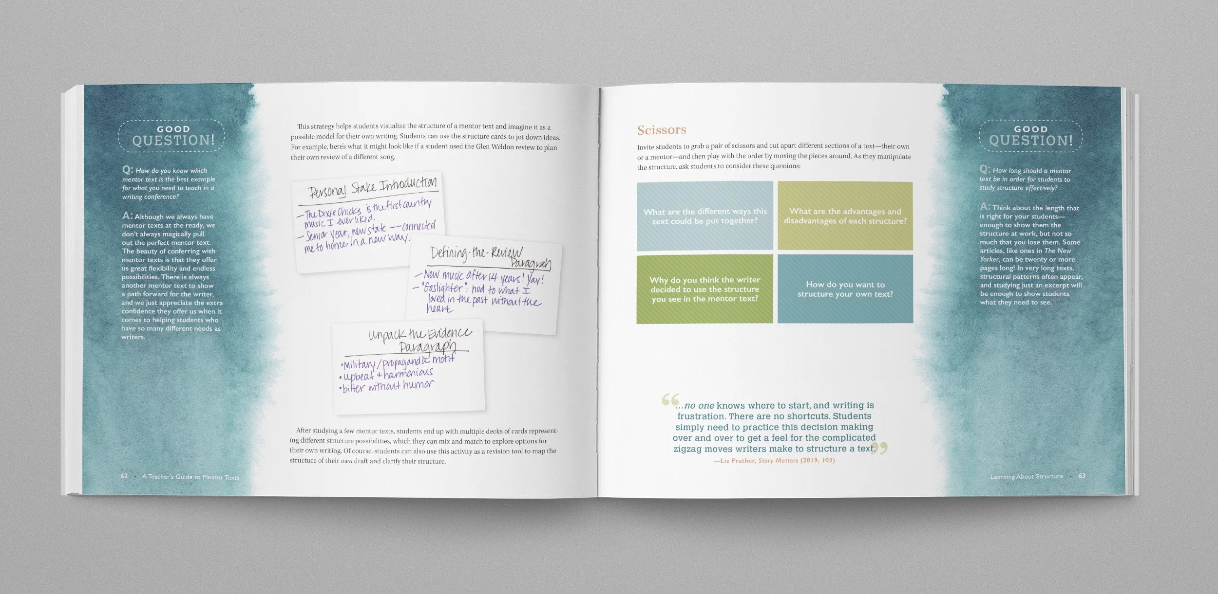
The Classroom Essentials series is what the publisher describes as an “enhanced design.” What that means is the books are chock-full of visuals, and the content presented in a highly designed, infographic manner, with less running text and more visuals then many of their regular titles. A large part of my job in designing and typesetting the Classroom Essentials books is creating these graphics by interpreting the tables or lists or sidebars or call outs from the manuscript in a fun and graphic way that is easy-to-digest and reflects the look and feel of the individual book.

downloadable online resources are also shown in the book
To create the sophistication level that the stakeholders were hoping for, I paid close attention to the pacing and flow of the book, using generous white space, and sprinkling in coordinating watercolor blooms throughout.
Each spread of the book is unique yet cohesive through the use of grid, typefaces, color, etc. This book required complete attention to detail to make the large amount of information digestible and to ensure I stayed within the allotted 136 pages.
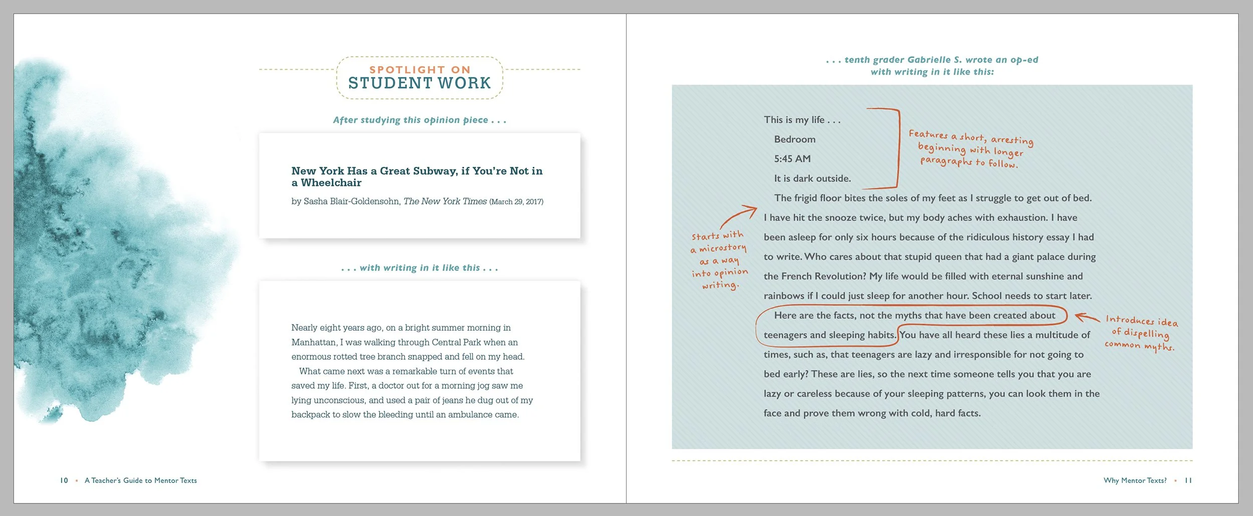
this repeating feature shows typeset mentor text (on a white rectangle) paired with typeset student work with teacher annotations (on a blue background)

this graphic was a bulleted list in the manuscript

final design, as shown in the book
At this point in the process I’m also finding stock photo options to help support the content and improve the flow for the reader. I worked with the stakeholders to choose just the right images, and photoshopped them all to visually coordinate.

final design, as shown in the book

the final book
At the completion of first pages (where I have the entire book laid out), the authors and editors are given the pages to review. There were the usual multiple rounds of edits from them, and most were minor copyediting for grammar or to stay inline with the Chicago Manual of Style, as well as some edits for content clarification and spacing-issues. The book went to the printer on time, and with all stakeholders happy.
the final book, interior spread