case study :
A Teacher’s Guide to Writing Workshop Essentials; Time, Choice, Response
title: A Teacher’s Guide to Writing Workshop Essentials; Time, Choice, Response
authors: Katherine Bomer and Corinne Arens
series: Classroom Essentials
publisher: Heinemann
publishing date: February 2020
my role: cover and interior design, typesetting, illustrations

The popular and critically acclaimed Classroom Essentials series, geared for newer as well as experienced teachers, is about foundational student-centered practices and is published by Heinemann. I created the aesthetic of the series, and set the standard of how information is presented in a highly designed, graphic form. I’ve typeset these extremely complex books, all with their own unique look and feel that fits within the series. I’ve managed this complexity while honoring the stakeholders’ visions and maintaining the schedule for each.
A Teacher’s Guide to Writing Workshop Essentials is the fourth book in the series. It is softcover, and 136 pages.
⇩
Cover
The authors, editor, and marketing were looking for a cover that was colorful, young, and showed student work. Photos of students themselves were optional, though the stakeholders wanted to see options that covered all varieties - typographical, graphic, photographs, etc. The book is for teachers grades K-5.
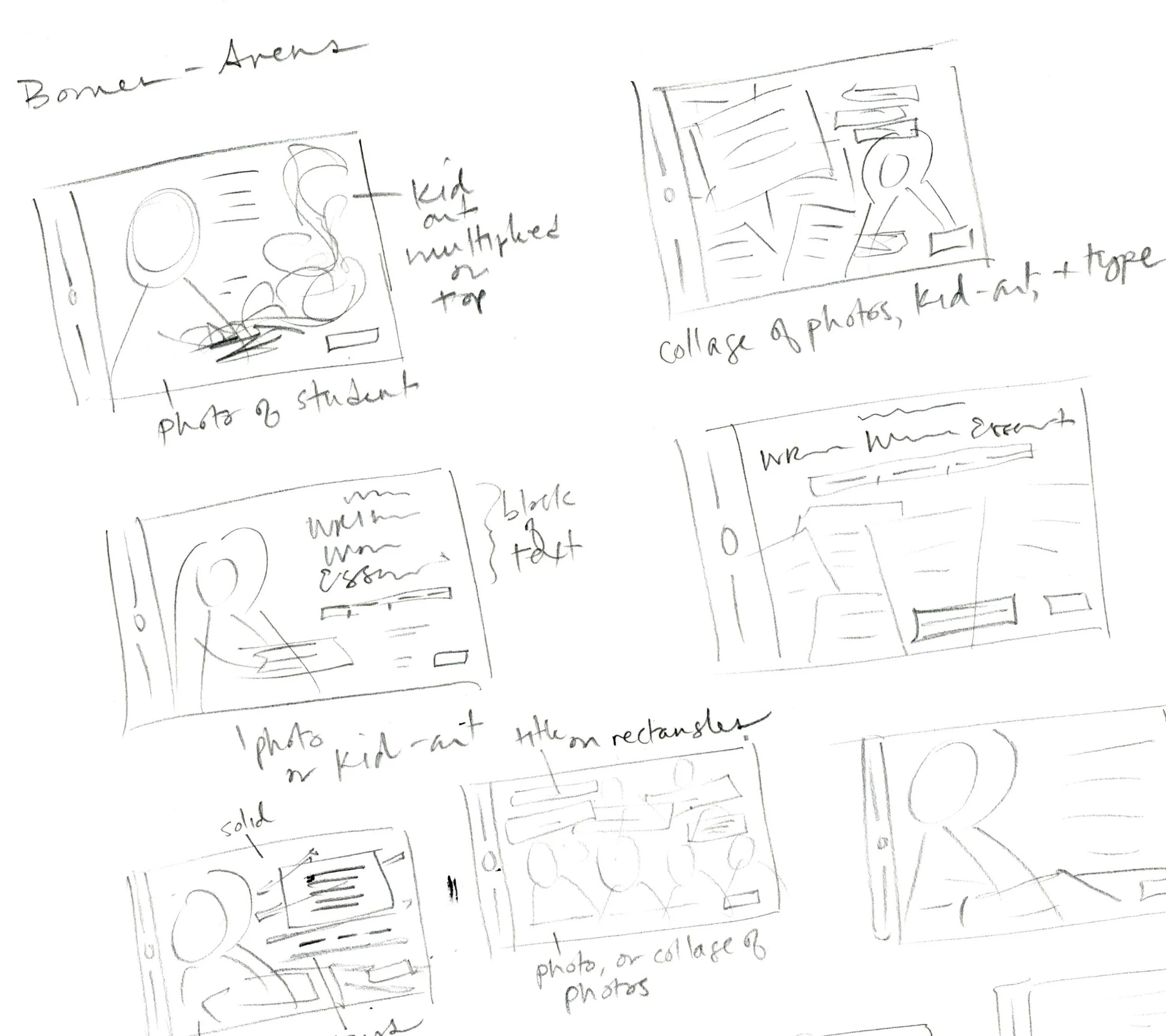
initial thumbnail sketches
My process of working on any book starts with research and inspiration-gathering. I make lists of words associated with the concepts of the book and collect images in Pinterest boards - samples of typography, photographs, posters, book covers, web graphics, infographics, stock images, color palette inspiration, and anything that catches my eye. From this collection I curate a moodboard for cover concepts, interior concepts, and possible typefaces to use. Then I sketch out rough thumbnails.
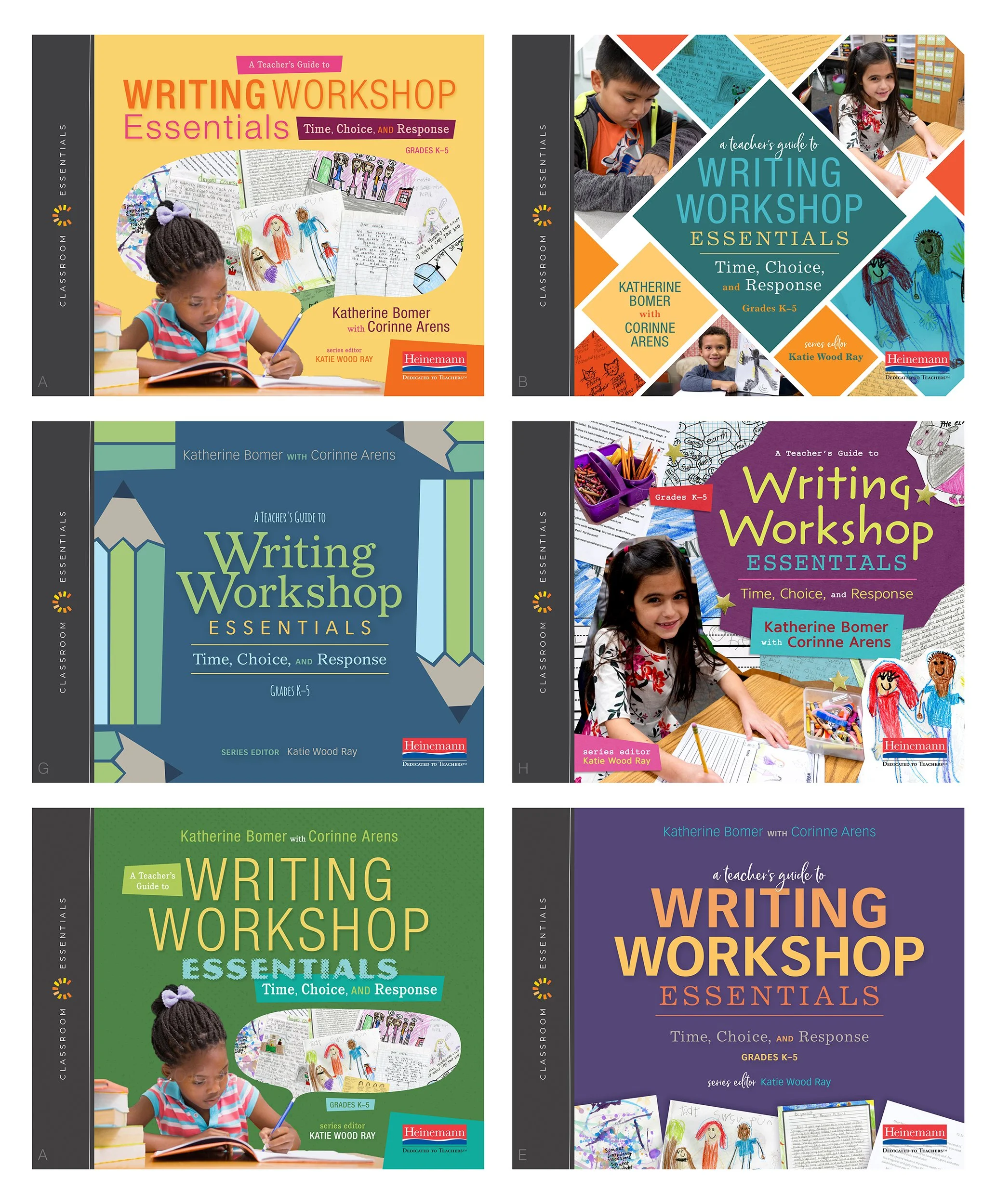
a few of the earlier cover options
Several features of the Classroom Essentials covers are boilerplate, such as the vertical charcoal bar with the CE logo, as well as the publisher’s logo in the lower right corner. Taking these into consideration, as well as the previous books in the series, I turned to InDesign and came up with cover options that would look unique and not resemble any of the previous titles in aesthetic or color.

the final cover
After I designed a number of options over several rounds, the purple cover with student work at the bottom became the final.

full cover
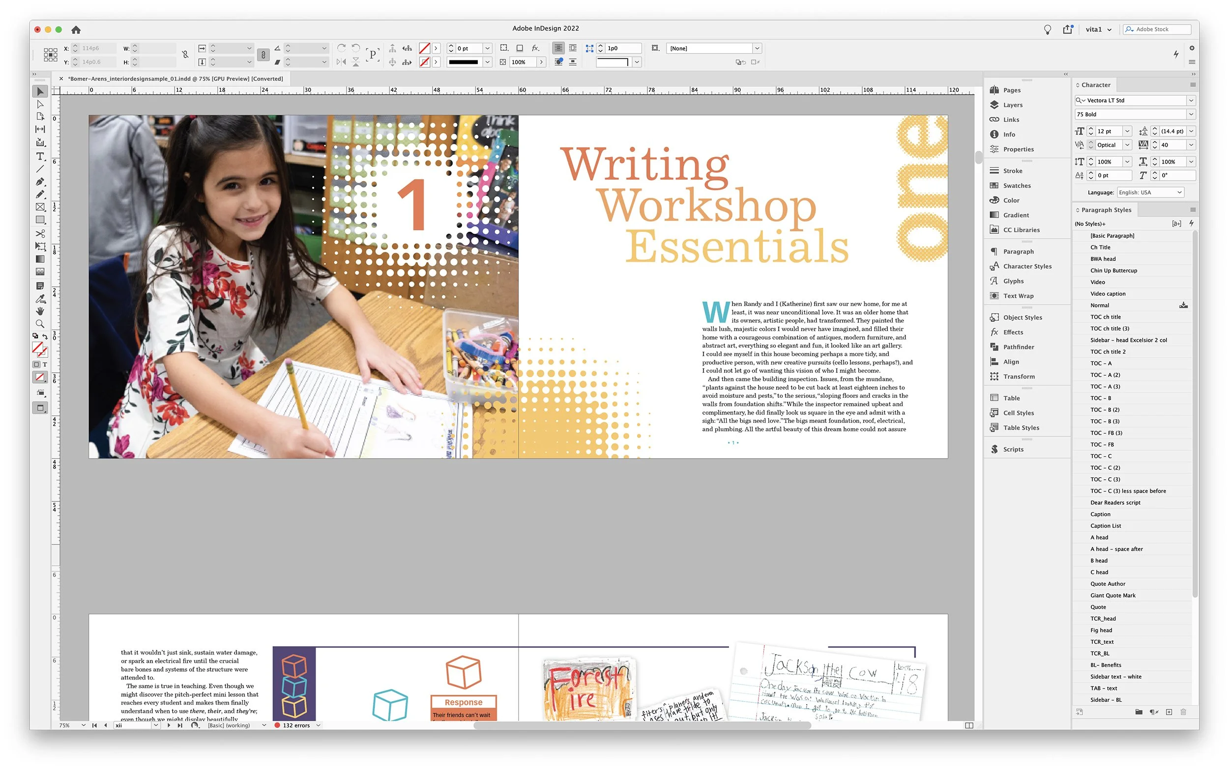
Interior Design Sample
Once the front cover was approved, I moved onto the Interior Design Sample. The sample consists of the front matter, at least one full chapter, and any other elements or design features that will be in the book, and is heavily influenced by the design of the cover.
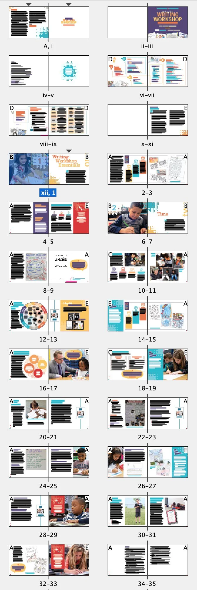
the entirety of the Interior Design Sample, round 1
the first pass of the Interior Design Sample
At this stage in the process the copy, photographs, and scans of student work that I used were mostly unedited. This is where I work out how I think the aesthetic of the book should be, based on the design of the front cover and the content of the book. I figure out the hierarchy of the text, determining the design of the A-heads, B-heads, basal text, and so on. This is also when I work to get all stakeholders on board with the look and feel, and it’s their opportunity to request design edits and clarify any issues.
a closer look at the chapter opener • Interior Design Sample, round 1
Some of the feedback from the first round included that the halftone-burst graphic felt “too math” and since this is a book about literacy, they asked for “something different.” I was also asked to give the chapter openers more color.

chapter opener, round 1

chapter opener, round 2

final chapter opener, as shown in the book
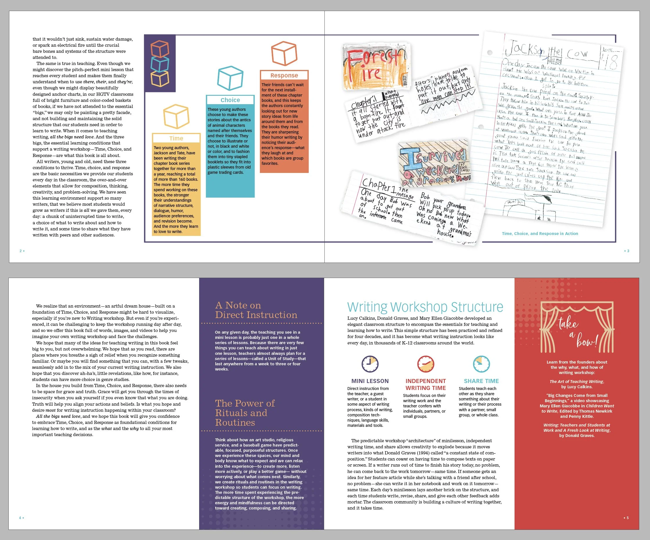
In order to add more of a handmade feel, and less of a mathematical tone, I used a paint-splatter texture to add to the recto pages of the chapter openers, as well as other paintbrushed shapes and effects (some of which I created and some were stock images) throughout the book.
Based on the feedback various repeating elements had the new paintbrushed graphics and details added to them, and the design overall started coming together for a cohesive look and feel. Headings and basal text were tweaked, and certain global elements were worked on. After several rounds of back-and-forth between myself and the stakeholders, we settled on a final design.
various elements, round 1

more elements, round 1

final design, as shown in the book
final design, as shown in the book
Typesetting
Once the Interior Design was approved, and the final manuscript was passed to me, I did a quick castoff to determine the page count. A Teacher’s Guide to Writing Workshop Essentials came in at 136 pages, with a trim size of 10” x 8” horizontal.
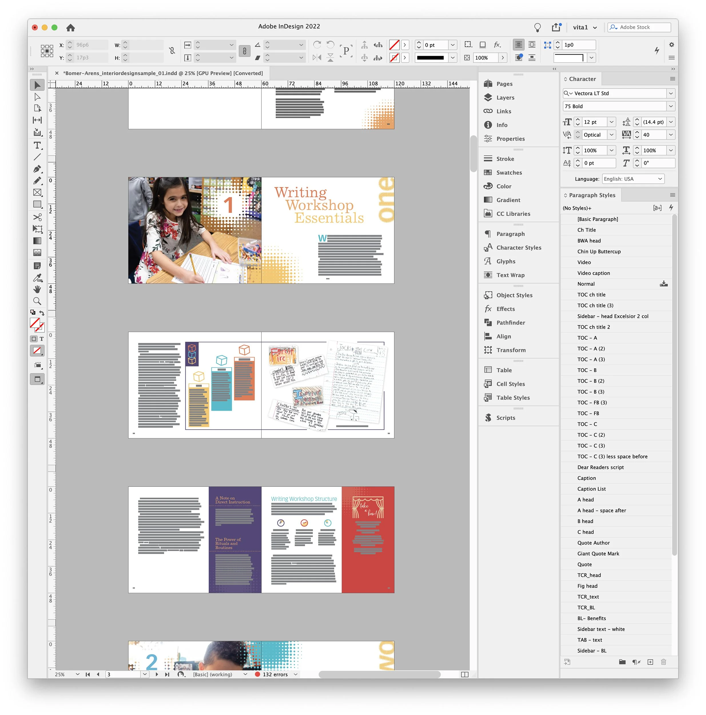
I set up my InDesign files using the Book feature and organized it so that each chapter or section of the book was a separate InDesign file. This helps me stay on top of the edits that I’m asked to do, and makes things easier to keep organized.
With long form documents in InDesign, I follow best practices such as using parent pages, conforming the design to a well-thought-out grid, snapping the basal text to the baseline grid, choosing legible and attractive typefaces for headings and running text, using paragraph and character styles, object styles, and so much more.
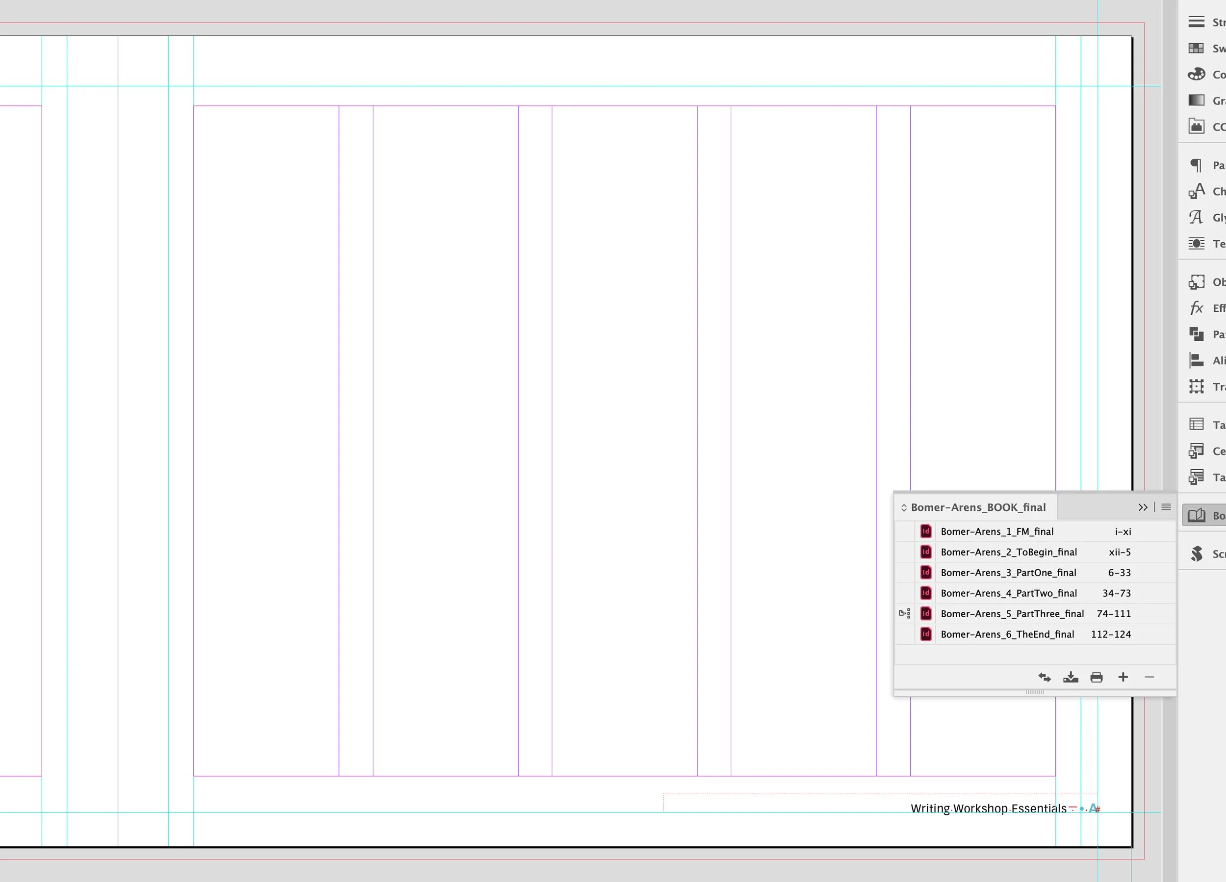
a view of the main grid I used in InDesign, and the Book panel

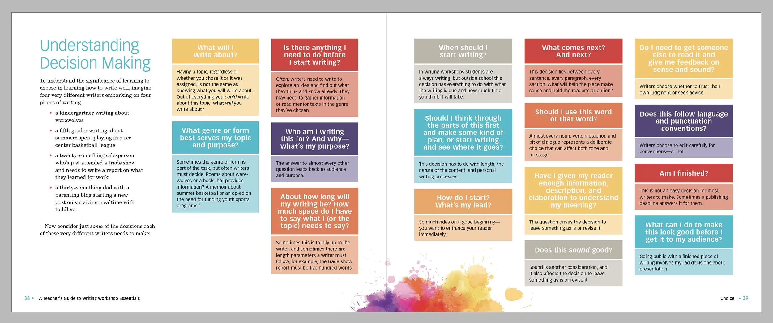
this graphic was a table in the manuscript
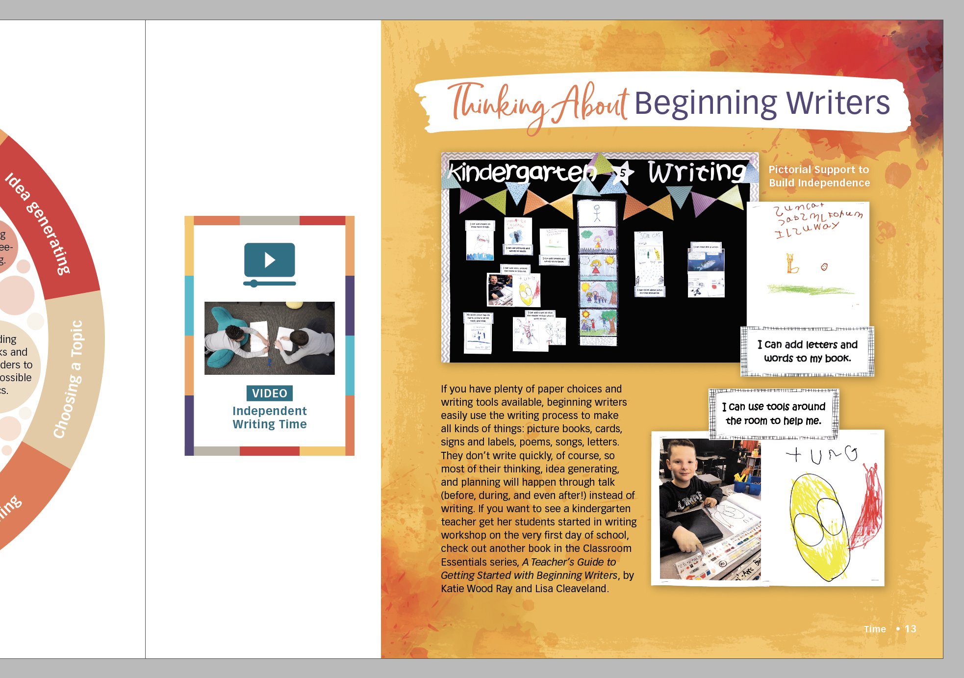
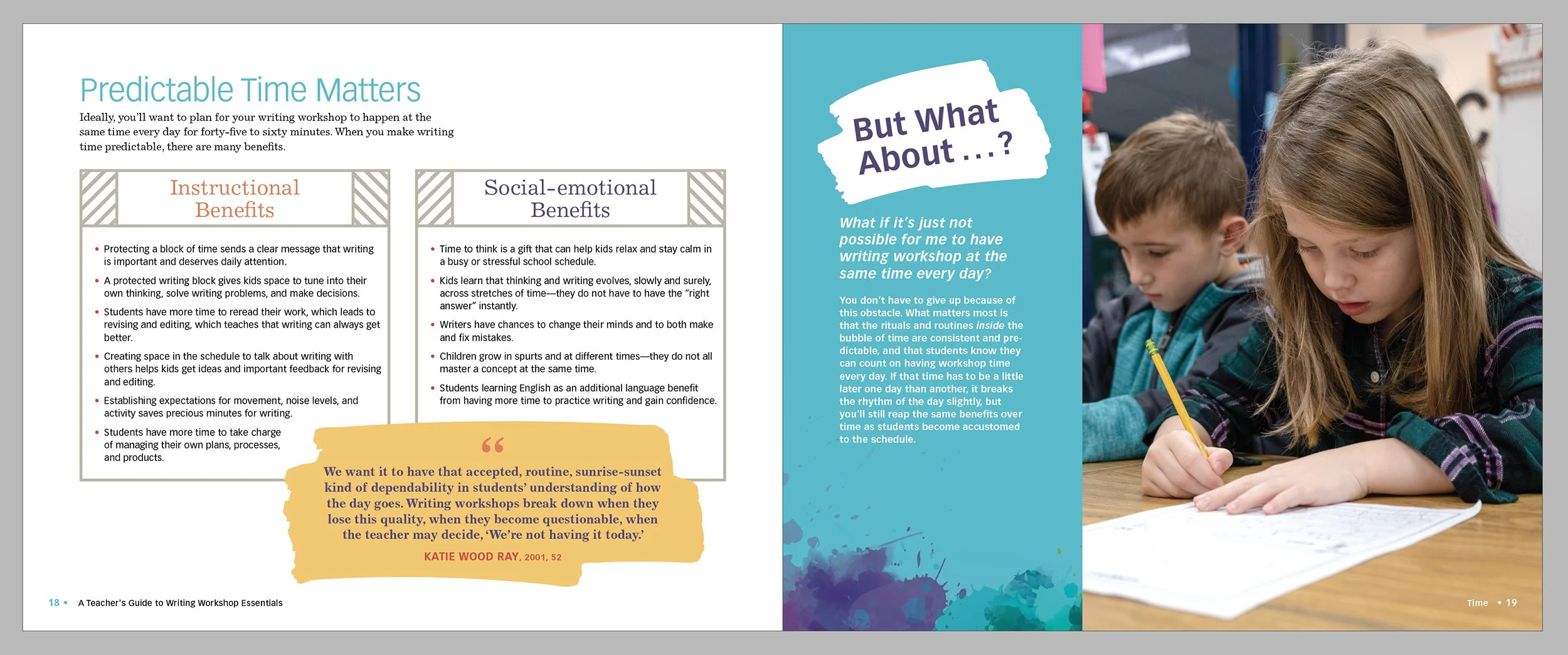
The Classroom Essentials series is what the publisher describes as an “enhanced design.” What that means is the books are chock-full of visuals, and the content presented in a highly designed, infographic manner, with less running text and more visuals then many of their regular titles. A large part of my job in designing and typesetting the Classroom Essentials books is creating these graphics by interpreting the tables or lists or sidebars or call outs from the manuscript in a fun and graphic way that is easy-to-digest and reflects the look and feel of the individual book.
Each spread of the book is unique yet cohesive through the use of grid, typefaces, color, etc. This book required complete attention to detail to make the large amount of information digestible, as well as pacing and flow and using white space, to make sure I stayed within the allotted 136 pages.
this graphic (verso page) was two bulleted lists in the manuscript
this graphic was a table in the manuscript

(inset) original image; (right) final image
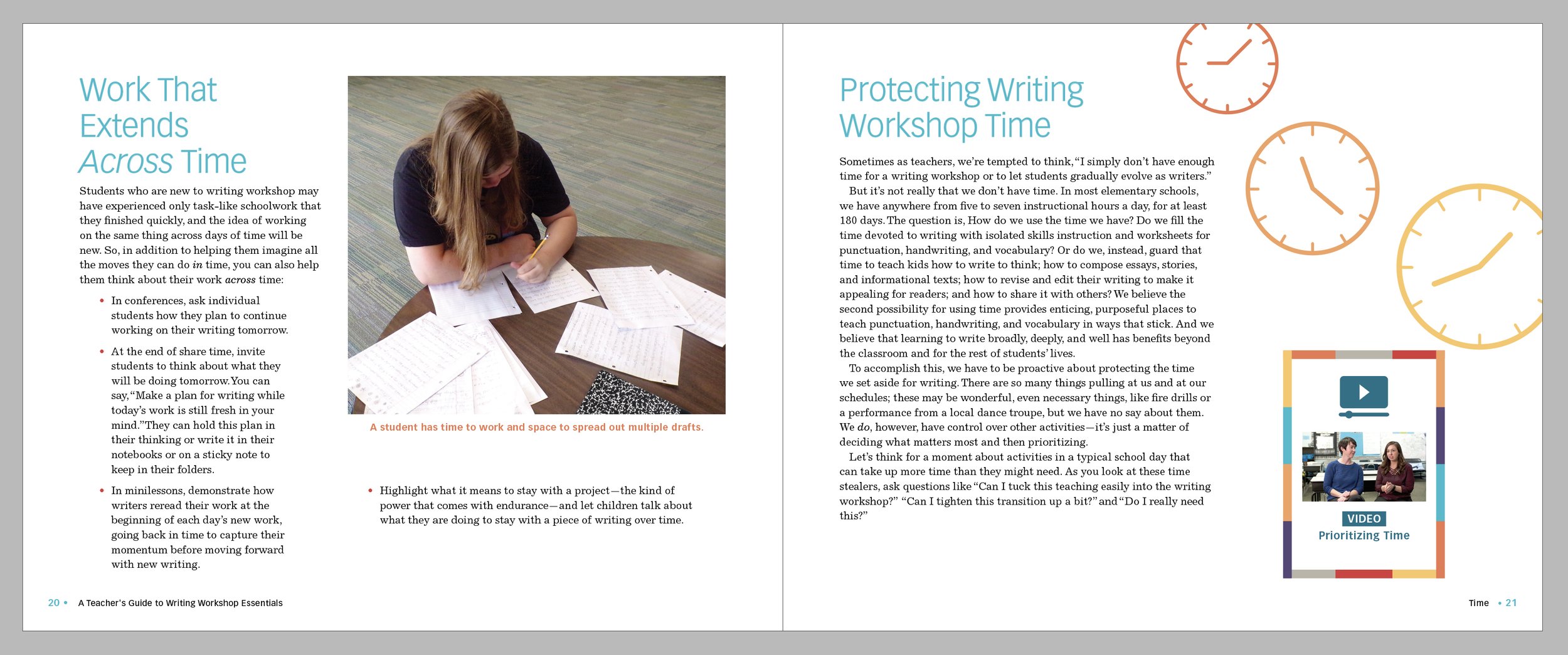
At this point in the process I’m also photoshopping all of the photos of students and classrooms and scans of student work that are in the book, as well as finding stock photo options when needed. Unfortunately, many of these photographs provided from the authors were not of a good-quality, nor was I given many of the original student work to scan or photograph myself, so I had to use Photoshop magic to make do.

(inset) original image; (right) final image
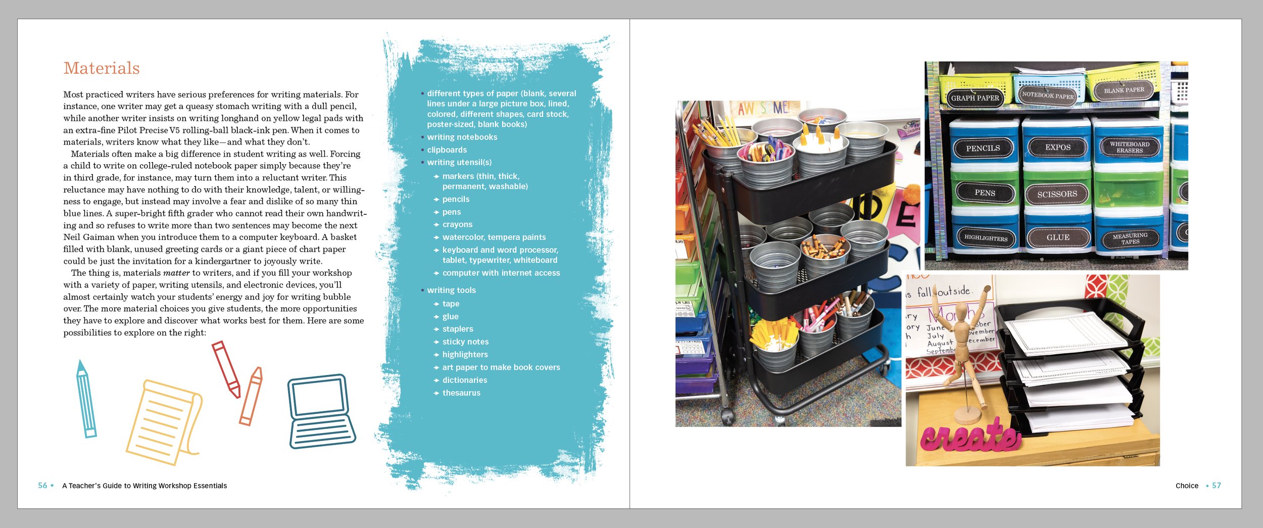
I created simple spot illustrations to use throughout the book, where space allowed, to help emphasize the content or add a boost to the design.


the final book
At the completion of first pages (where I have the entire book laid out), the authors and editors are given the pages to review. There were the usual multiple rounds of edits from them, and most were minor copyediting for grammar or to stay inline with the Chicago Manual of Style, as well as some edits for content clarification and spacing-issues. The book went to the printer on time, and with all stakeholders happy.

the final book, interior spread